Agenda Artikelen Programma Zoeken Contact Partners Auteurs

#3 - Colour as communication

When you’re trying to communicate a message through imagery, colour can work against the transmission of the message. Our brains take more time to process colour imagery than black-and-white imagery because there is more information to process. This makes black-and-white imagery faster to ‘read’ than colour imagery.

160921-witte-rook-graphic-design-comics-3-colour-1

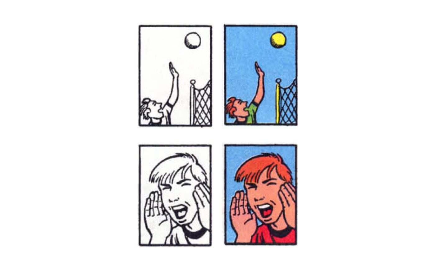
‘These colors objectify their subjects. We become more aware of the physical form of objects than in black-and-white. A game in motion becomes a ball in the air. A face showing emotion becomes a head and two hands.’[1]

On top of increasing ‘reading‘ time, realistic colouring objectifies pictures. It enables your brain to process the physicality of the shown imagery, which makes the image more realistic. All of this enables the viewer to see an image as something which is closer to a photograph than to try to understand the message that is trying to be communicated.

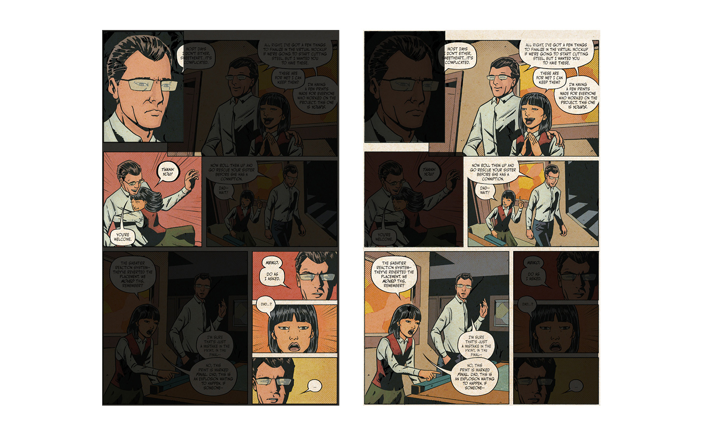
In comics, the use of multiple images one after another liberates separate panels from having to communicate everything at once. Some panels can be dedicated to pushing the story forward, and others can be devoted to delivering emotional impact.

160921-witte-rook-graphic-design-comics-3-colour-2

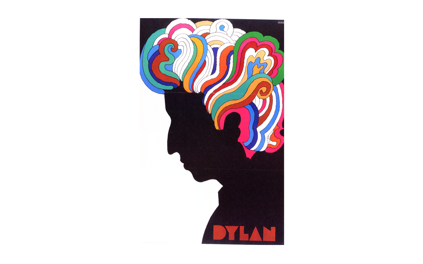
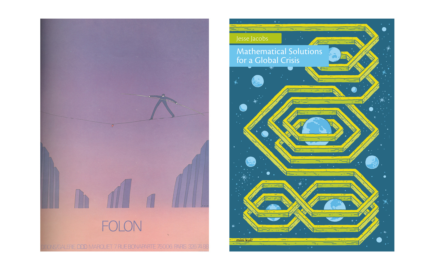
In graphic design, the use of image sequences isn’t always an option but, even then, colour can be used very effectively to create a specific atmosphere, as shown in Milton Glaser’s Dylan poster.

160921-witte-rook-graphic-design-comics-3-colour-3

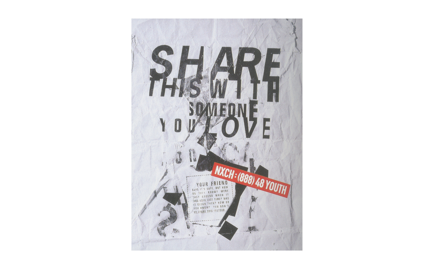
Instead of using colour as decoration, you can use it more effectively by giving it purpose. For example, as this second poster by Martin Venezky attracts attention to the phone number.

160921-witte-rook-graphic-design-comics-3-colour-4

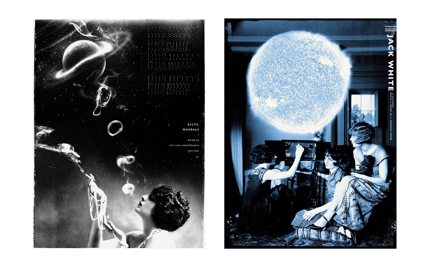
Whether it is the use of a single colour, shades of a colour, or multiple colours, visual artists are able to use colour without hindering the transmission of information. These gig posters effectively use black-and-white and a single colour to harmoniously assemble eclectic visual elements and to set a specific mood.

160921-witte-rook-graphic-design-comics-3-colour-5

Not to say that realistic colouring, or colour as decoration has no use. For example, if you want to suspend disbelief when showing a fictional setting, colour can be a potent communication vehicle, making fiction more realistic, believable, and accessible.

160921-witte-rook-graphic-design-comics-3-colour-6

160921-witte-rook-graphic-design-comics-3-colour-7

In the end, it is not about whether to use colour (or any other aspect of imagery) or not, it’s about finding what is most appropriate to get to what you are trying to achieve. Colour is an extremely potent visual element which can be used in a myriad of ways, e.g. as a signal of importance, to evoke an emotional response, or to introduce meaning.

160921-witte-rook-graphic-design-comics-3-colour-9

It comes down to this: how can you use the tools you have at your disposal to best reach your goals?
www.ethnographic.design


Auteur:
Hector Pahaut

leiden

Graphic Design & Comics is a series of observations focused on the relationship between graphic design and comics.

Aside from being a collection of observations, this is also a petition for designers to immerse themselves into other disciplines. I believe infusing graphic design with just a little bit of the spirit of comics, or any other medium, allows us to keep pushing the boundaries of what is possible and acceptable within our own field. By looking at, and learning from other worlds, we can expand the definition of design.

___

Notes
1 - McCloud, S. (1994). Understanding Comics. New York: Harper Collins Publishers. p. 189.

___

Image Sources
1 - McCloud, S. (1994). Understanding Comics. New York: Harper Collins Publishers. p. 189.
2 - DeConnick, K. & De Landro, V. & Wilson IV, R. & Peter, C. & Cowles, C. & Hughes, R. (2016). Bitch Planet #6. Berkeley: Image Comics. p. 12.
3 - Glaser, M. (1966). Dylan. from Lupton, E. (2015). How Posters Work. New York: Cooper Hewitt, Smithsonian Design Museum.
4 - Venezky, M. (1997). San Francisco AIDS Commission: NXCH (Needle Exchange). http://www.appetiteengineers.com/.
Accessed 31–5–2016. http://www.appetiteengineers.com/project/san-francisco-aids-commission-nxch-needle-exchange/
5 - The Silent Giants & Rob Jones. (2014). Arctic Monkeys — Morrison, CO.
6 - The Silent Giants (2014). Jack White — Seattle, WA.
7 - Remender, R. & Tocchini, G. Albuquerque. (2015). Low #7. Berkeley: Image Comics. p. 5.
8 - Schuiten, L. (2014). La Ville Résiliante.
9 - Moebius. (2011). Voyage D’Hermès.
10 - Folon, J-M. (1978). Editions Marquet. Posters by Folon. New York: Harry N. Abrams.
11 - Jacobs, J. (2014). Mathematical Solutions for a Global Crisis. http://onemillionmouths.tumblr.com/.
Accessed 31–5–2016. http://onemillionmouths.tumblr.com/post/101289273209/new-mini-ku%C5%A1-available-here
12 - Victore, J. (1994). What is Philosophy?. from Victore, J. (2010). Victore. or, Who Died and Made You Boss?. New York: Abrams.

___

© 2016 Hector Pahaut

 
graphic design & comics:
#1 - Change is story is life
A single image is a powerful tool to set a mood, but if you want to tell a story, you’re going to have to introduce change in on...
 
graphic design & comics:
#2 - Text and visuals complement each other
Images and words have different strengths. In general, images are powerful at communicating things from the physical world, and wo...
 
WKNDX:
Doris Sparreboom over haar werk en fascinaties
"Kunst maken was niet een hele bewuste keuze denk ik. Ik ben al zo lang als ik me kan herinneren bezig met het maken van dingen. T...
Door: Gastauteur