
graphic design & comics:
#1 - Change is story is life

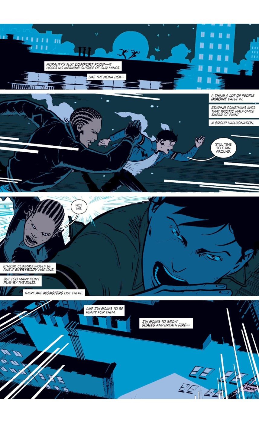
Images and words have different strengths. In general, images are powerful at communicating things from the physical world, and words are great at describing abstract phenomena.
 Scott McCloud puts it this way in Understanding Comics: ‘[…] words themselves, more than all the other visual symbols, have the power to completely describe the invisible realm of senses and emotions. […] pictures can induce strong feelings in the reader, but they can also lack the specificity of words. Words, on the other hand, offer that specificity, but can lack the immediate emotional charge of pictures […]. Together, of course, words and pictures can work miracles.’[1]
Within graphic design, the complementary relationship between text and visuals is nearly always present, as is seen in many infographics.
But it can also be implemented in other expressions of graphic design. For example, if you want to make an advertisement to communicate that store X is giving away free shoes, it is very effective to show an image of a shoe (which people will recognize instantly) and to write ‘free’ on the advertisement. Though it wouldn’t necessarily be in the way of communicating the message to write ‘shoes’ instead of showing them, using an image has some benefits. In this case, you can show the specific brand or model of shoes. On the other hand, it would be significantly more difficult to directly communicate ‘free’ with imagery, whereas the word is instantly clear.
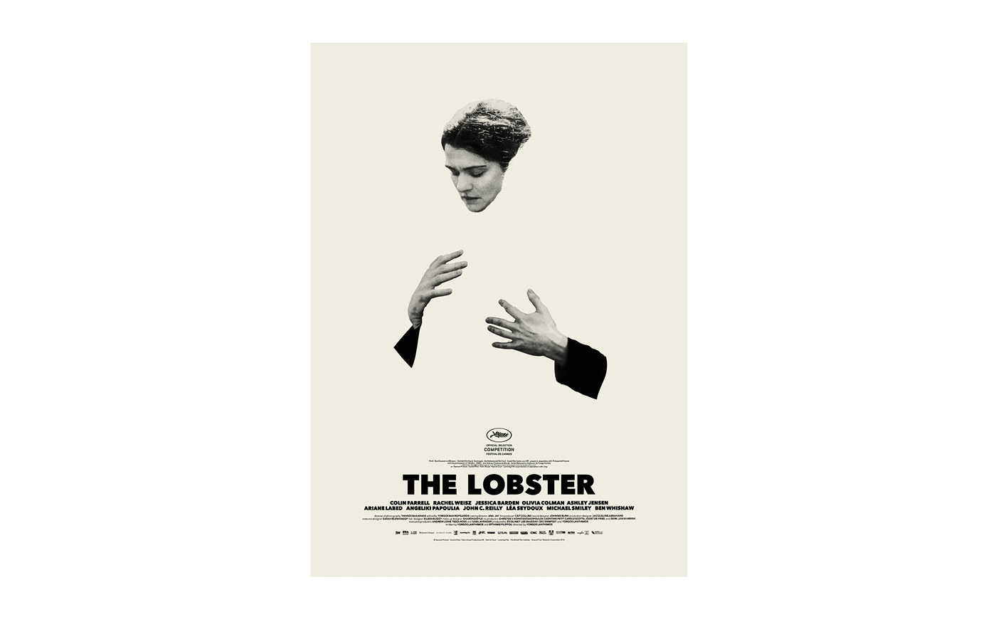
The opposite can be true too. Feelings can be communicated very effectively through images, think of expressionist works of art like those of Jackson Pollock or Edvard Munch, or even just a photograph of two lovers kissing. And sometimes, words can be used to great effect to describe the physical world, such as for addresses, which can be shown through imagery, though having a textual shorthand significantly helps in the sharing of that kind of information.
Which medium is the best at conveying a part of a message very much depends on what is being communicated; but, in general, images and words can be used in a complementary fashion to communicate specific aspects of a message. In Words About Pictures, Perry Nodelman looks at the synthesis of text and illustration in picture books, ‘[…] as we respond to words and pictures which tell us about the same events in different ways, we must integrate two different sorts of information about the same events.’[2]
‘Generally speaking, the more is said with words, the more the pictures can be freed to go exploring and vice versa. […] When a scene shows you all you ‘need’ to know, […] the latitude for scripting grows enormously. […] On the other hand, if the words lock in the ‘meaning’ of a sequence, then the pictures can really take off.’[3]
 When working with text and imagery, it is always interesting to think about the relationship between both media and how they can be used harmoniously.
As Nick Sousanis sums it up in Unflattening: ‘While image is, text is always about. […] Each informs and enriches the other to achieve a meaning, as R.C. Harvey says, “that neither conveys alone without the other.”’[4]