Agenda Artikelen Programma Zoeken Contact Partners Auteurs

#5 - Illusion of time through narrative

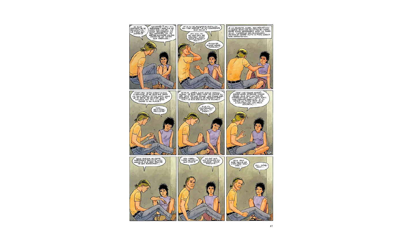
One of the most intrinsic aspects of comics is the sequencing of imagery. Images follow each other to tell stories where characters move, talk, think, and eventually, come alive.
160921-witte-rook-graphic-design-comics-5-narrative-1

Narrative creates the illusion of time, whether it is in written form in novels, or in comics where words and images follow each other, any story deals with the passing of time. Even the shortest of examples can trigger the feeling that time has passed, e.g. ‘For sale: baby shoes, never worn.’[1]

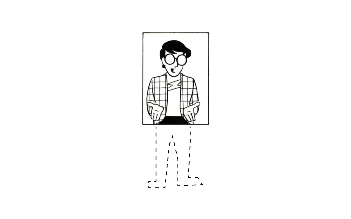
‘This phenomenon of observing the parts but perceiving the whole has a name. It’s called closure. In our daily lives, we often commit closure, mentally completing that which is incomplete based on past experience. […] In an incomplete world, we must depend on closure for our very survival.’[2]
160921-witte-rook-graphic-design-comics-5-narrative-2

Here, Scott McCloud talks about how we automatically complete ‘incomplete’ images. This ‘observing the parts but perceiving the whole,’ or ‘closure,’ is also inherent to storytelling. By compressing stories to their essence, we can tell tales of a thousand years in minutes. As we saw previously, stories that don’t tell you much can speak volumes.

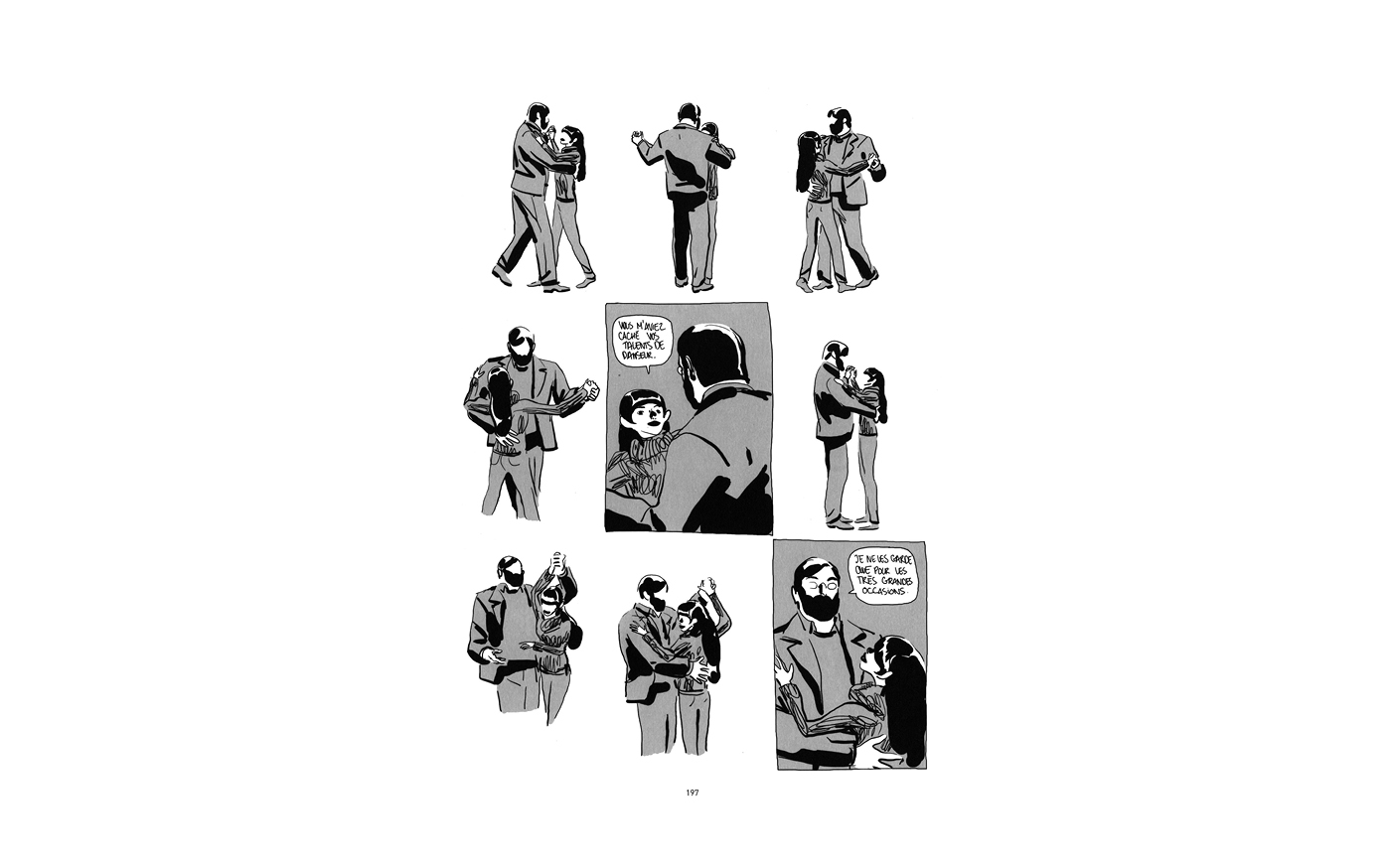
Knowing this enables designers to create visuals that step outside of their two-dimensional worlds. By using sequences of images, or images where movement is shown, rather than a single, static image, you can animate imagery to create the illusion of time.
160921-witte-rook-graphic-design-comics-5-narrative-3

Time is a phenomenon we know from our four-dimensional world; by using narrative to create the feeling of time passing, images are brought to life by making flat imagery seem more real, alive, and relatable by infusing this one aspect of ‘real life’ into them.

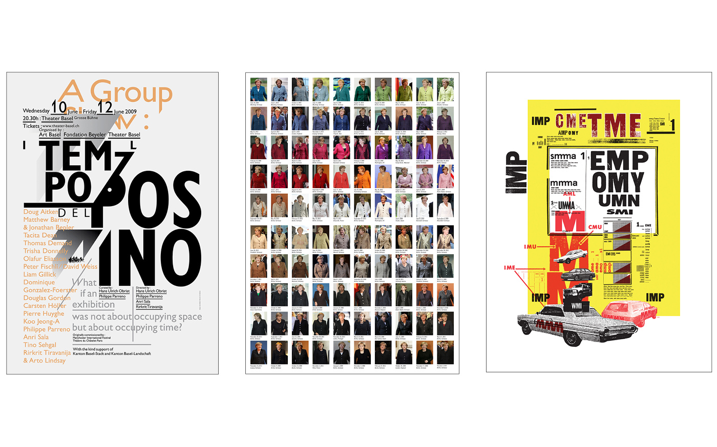
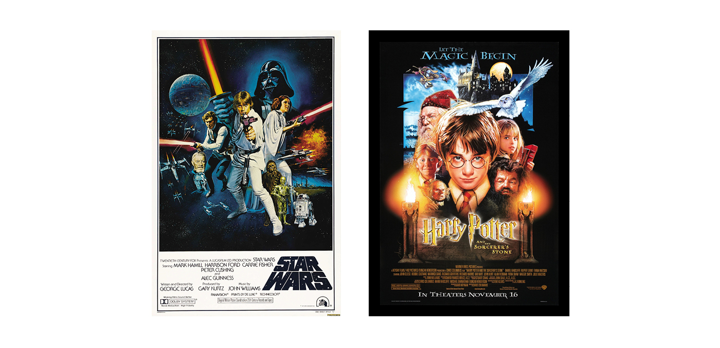
Visuals don’t necessarily need to be put in narrative sequences to call on this effect. Another way to induce a feeling of passing time is to create an imagery overload where a prolonged measure of time is necessary to ‘read’ the whole image. Examples of this effect can often be seen in the works of graphic designers like Ludovic Balland, Noortje van Eekelen, or Martin Venezky; or in movie posters where images are often taken from different parts of a story to create an overall feeling of what the movie will be like.
160921-witte-rook-graphic-design-comics-5-narrative-4

160921-witte-rook-graphic-design-comics-5-narrative-5

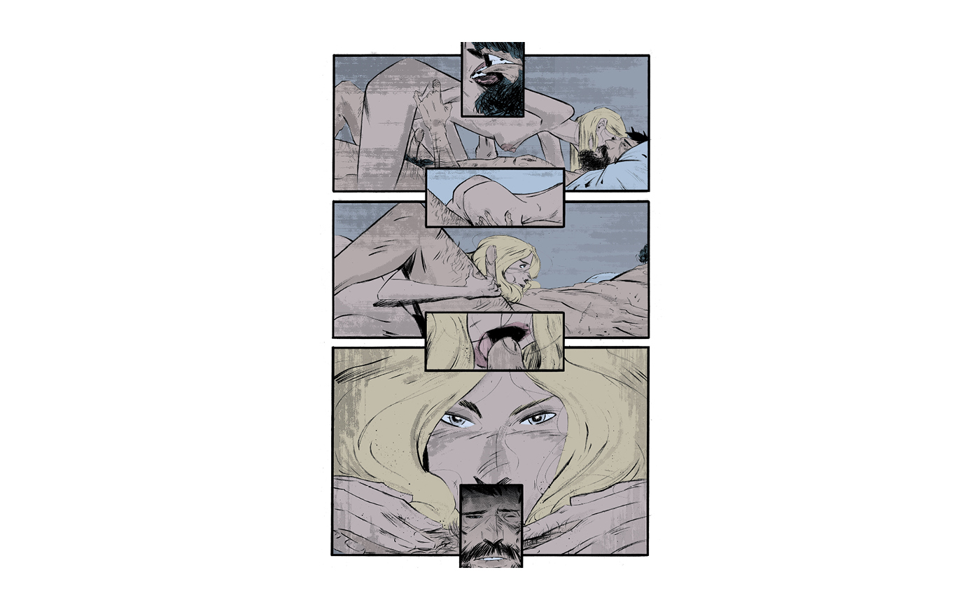
‘What is specific to comics — one of the things — are the empty spaces between the panels. These spaces are pure imagination. By interacting with a comic we fill the space with our imagination, we engage our senses, we recover our senses, we learn to see more, hear more, feel more.’[3]
160921-witte-rook-graphic-design-comics-5-narrative-6

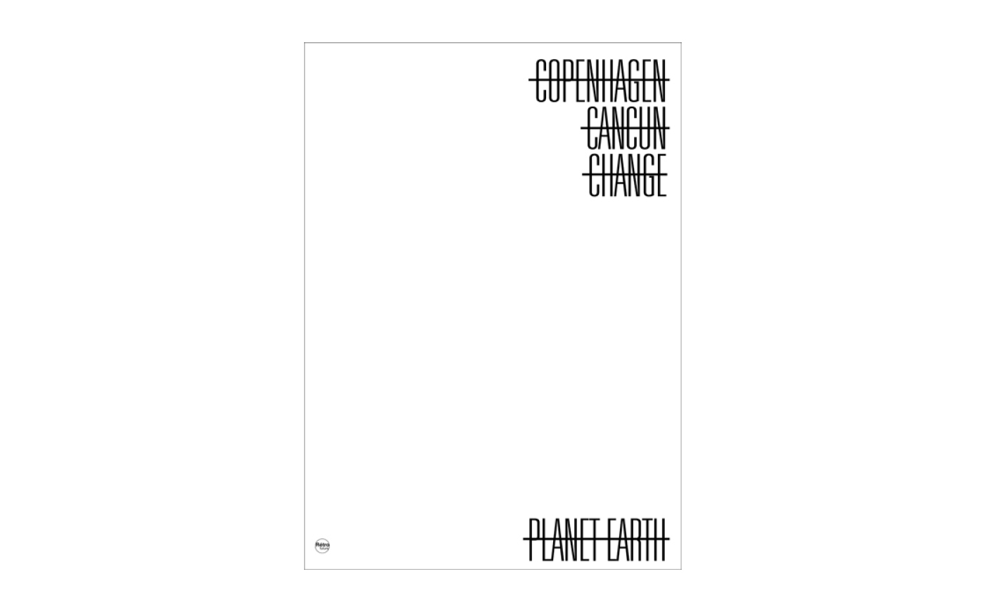
I believe infusing graphic design with just a little bit of the spirit of comics, and any other medium for that matter, allows us to keep pushing the boundaries of what is possible and acceptable within graphic design.

By looking at and learning from other media, we can expand the definition of design.
160921-witte-rook-graphic-design-comics-5-narrative-7


Auteur:
Hector Pahaut

leiden

Graphic Design & Comics is a series of observations focused on the relationship between graphic design and comics.

Aside from being a collection of observations, this is also a petition for designers to immerse themselves into other disciplines. I believe infusing graphic design with just a little bit of the spirit of comics, or any other medium, allows us to keep pushing the boundaries of what is possible and acceptable within our own field. By looking at, and learning from other worlds, we can expand the definition of design.

___

Notes
1 - Wikipedia. (2016). For sale: baby shoes, never worn. https://en.wikipedia.org/.
Accessed 31–5–2016. https://en.wikipedia.org/wiki/For_sale:_baby_shoes,_never_worn
2 - McCloud, S. (1994). Understanding Comics. New York: Harper Collins Publishers. p. 63.
3 - Kot, A. (2014). The Shaman Speaks of War: Ales Kot Interviewed. http://thequietus.com/.
Accessed 31–5–2016. http://thequietus.com/articles/16706-ales-kot-interview

___

Image Sources
1 - Léo. (1995). Aldebaran tome 2. La Blonde. Dargaud. p. 47.
2 - McCloud, S. (1994). Understanding Comics. New York: Harper Collins Publishers.
3 - Vivès, B. (2011). Polina. Pantin: Casterman. p. 192.
4 - Balland, L. (2009). Il Tempos del Postino. http://www.ludovic-balland.com/.
Accessed 31–5–2016. http://www.ludovic-balland.com/en/poster/167/pil-temposbr-del-postino-p.html
5 - Eekelen, N.v. (2012). Pantone Merkel.
6 - Venezky, M. (2011). Getting Upper Poster Project: “Letter M”. http://www.appetiteengineers.com/.
Accessed 31–5–2016. http://www.appetiteengineers.com/project/getting-upper/
7 - Chantrell, T. (1977). Star Wars.
8 - Struzan, D. (2001). Harry Potter and the Philosopher’s Stone.
9 - Kot, A. & Ortiz, R.L. & Bellaire, J. & Muller, T. (2014). Zero #11. Berkeley: Image Comics. p. 5.
10 - Massa-Bidal, S. (2010). Yes we Cancun, but we probably won’t. https://www.flickr.com/.
Accessed 31–5–2016. https://www.flickr.com/photos/hulk4598/5220544612/in/photolist-7mfwCu-7xyqUA-7UGhoj-7Fwn13-7E6UXP-6Tsxmy-dgkXWB-6vuCAk-6eZw8k-9Jo5qx-8aDTWr-9zwhyB-6yPTiJ-6wnLBg-69HygU-73DeWB-73DeXz-7DK16w-73DeJt-5Y6QSf-9zzgMN-67WLQg-8XjE2S-7jJYbs

 
graphic design & comics:
#1 - Change is story is life
A single image is a powerful tool to set a mood, but if you want to tell a story, you’re going to have to introduce change in on...
 
graphic design & comics:
#4 - Simplifying visuals to emphasize the message
Simplifying imagery can be of great use when trying to communicate a message. For example, if you want to show a hand, you can sho...
 
graphic design & comics:
#3 - Colour as communication
When you’re trying to communicate a message through imagery, colour can work against the transmission of the message. Our brains...