 Agenda
Artikelen
Programma

A single image is a powerful tool to set a mood, but if you want to tell a story, you’re going to have to introduce change in one way or another. In comics, this is traditionally done by sequencing images one after the other.
‘Taken individually, [pictures] are merely that: pictures. However, when part of a sequence, even a sequence of only two, the art of the image is transformed into something more: the art of comics.’[1]
‘Comics panels fracture both time and space, offering a jagged, staccato rhythm of unconnected moments. But closure [observing the parts but perceiving the whole] allows us to connect these moments and mentally construct a continuous, unified reality.’[2]
By using visual sequences, all kinds of different events can be portrayed to show movement, sound, colour transitions, life… all through a two-dimensional medium.
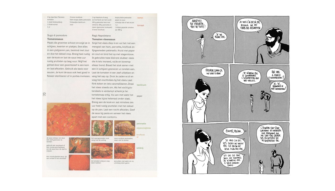
Change is how we perceive the world around us. It would be too much work for our eyes to constantly ‘refresh’ everything we see. Instead, our brains only take in the data it needs to create an accurate representation of the present by updating only what moves, what changes.
‘For a long time, we thought our eyes transmit all of the signals they receive to the brain, then the brain decides what to do with the information. Neuroscientists have now discovered that the interaction between the eyes and the brain is much more intuitive, more fuzzy. The eyes mainly register change. This happens through a similar mechanism the media implement. You can make a newspaper which covers everything that happens in the world, but it is more practical to just cover what changes, the news. In this way, you avoid information overload and loss of resources. For the media, this saves money, time and paper. With the eye, it enables freedom of movement. Aside from transmitting visual information, the human eye has to be able to rotate, which limits the thickness of the optical nerves. Thinner nerves allow fewer signals to travel through them, but they give the eye more flexibility. […] Similarly to the brain, the retina processes data. It freezes the visual information of the space you are in which doesn’t change and only transmits local variations.’[3]
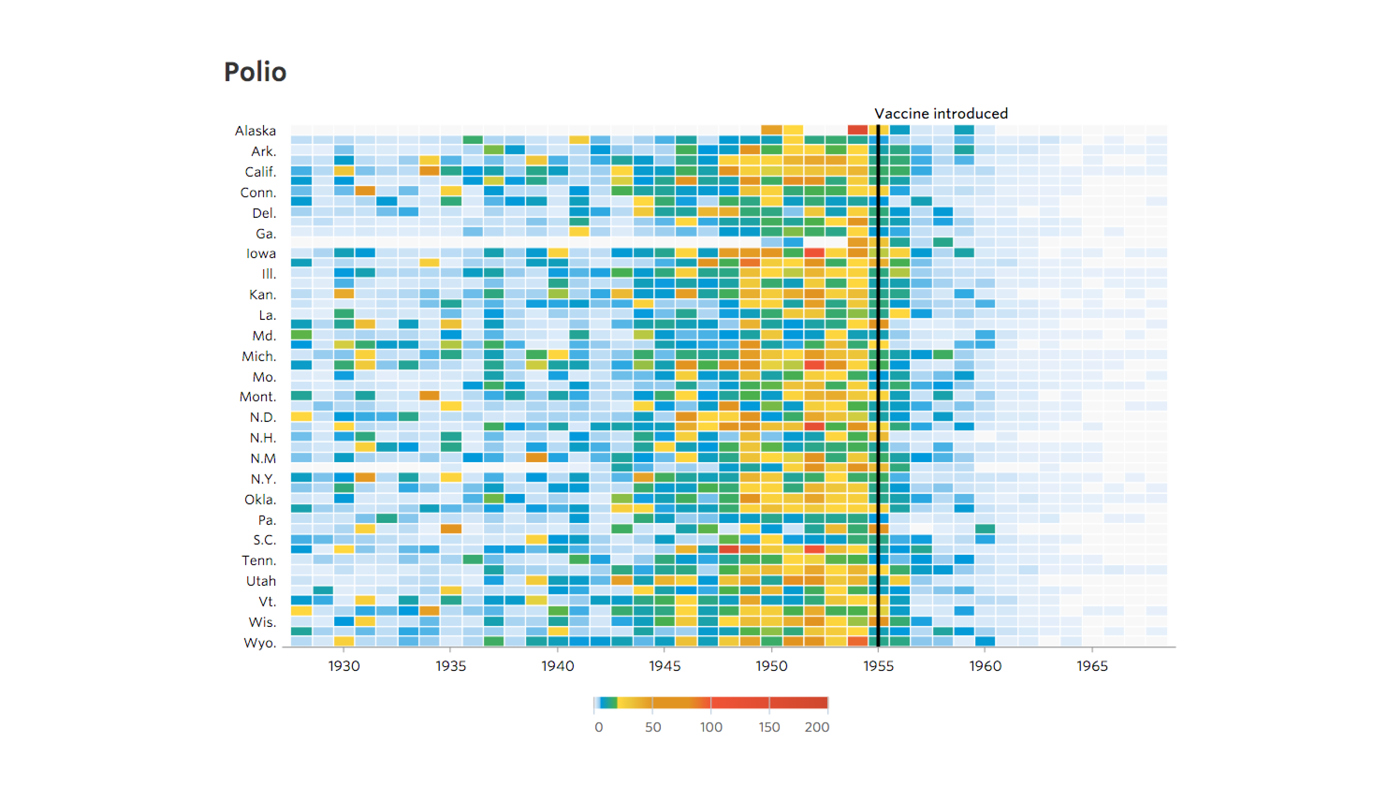
With this in mind, we can use visual change as an indicator of evolving information, as shown in the infographic about the effect of the introduction of the polio vaccine in the USA.
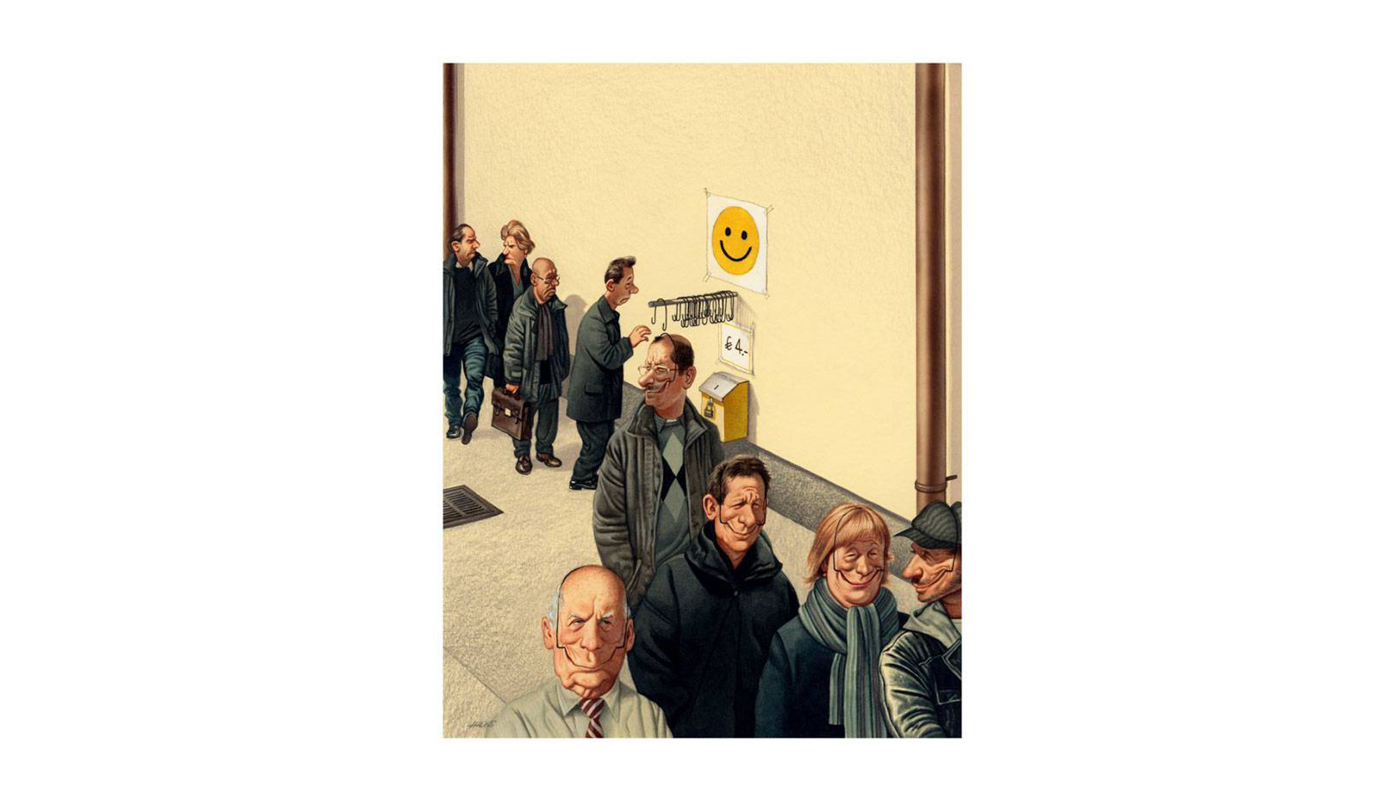
Sequencing imagery isn’t the only way to signal change. It is also possible to create a story with visual change within a single image, which can be seen in the previous example. The next image shows this being done in comics.
And, to further increase the scope of an image, future developments can also be hinted at instead of directly shown by ‘[choosing] a single point in a narrative to suggest the whole story’[4] as shown in the following poster.

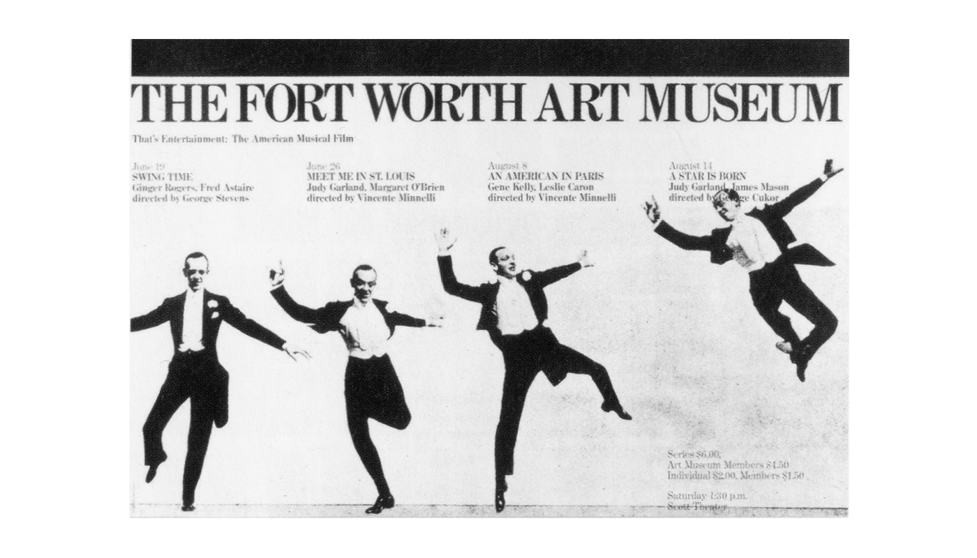
What follows is a combination of the previous ideas, where change is shown, but the action is not completed to increase the tension:
‘In Massimo Vignelli’s poster for That’s Entertainment: The American Musical Film (1976), dancer Fred Astaire leaps across the surface in a series of still images. Vignelli has stopped the story arc at its peak, leaving it to the viewer to complete the action. By choosing the high point in the narrative (physically and metaphorically), Vignelli has amplified the sense of drama and movement.’[5]
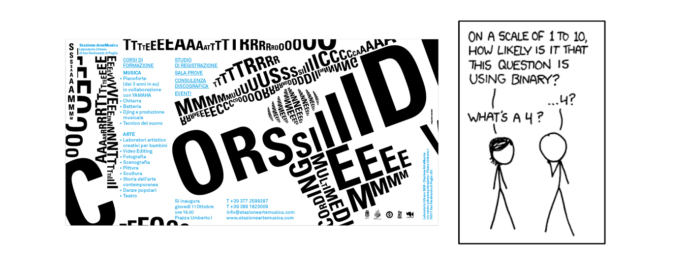
 It is also possible to represent change through other kinds of visual information than imagery. For example, by using language.
‘[…] words introduce time by representing that which can only exist in time: sound.’[6]
In a lot of one-panel comics words become the main signals of change, they are what turn flat images into live conversations or compositions.
This aspect of visual communication extends into an even broader perspective, where the use of story enables visual artists to step outside of their two-dimensional worlds to get closer to our experience of reality. I will expand upon this idea during this series of articles and more directly in the fifth and final article: Illusion Of Time Through Narrative (upcoming).