 Agenda
Artikelen
Programma

Simplifying imagery can be of great use when trying to communicate a message. For example, if you want to show a hand, you can show a picture of a hand which shows bone structure, nails, wrinkles in the skin, colour tones, hairs, etc. But if all of those details aren’t important to the message you’re trying to get across, you could also just show the silhouette of a hand.
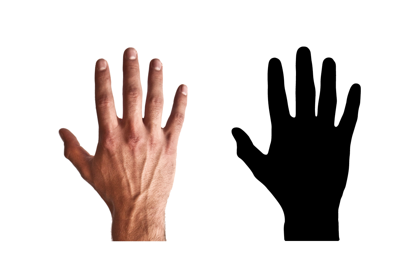
By simplifying imagery, you don’t only improve communication by removing elements which aren’t essential to transfering the message, it also allows you to emphasize what is truly important.
‘When we abstract an image through cartooning, we’re not so much eliminating details as we are focusing on specific details. By stripping down an image to its essential ‘meaning,’ an artist can amplify that meaning in a way that realistic art can’t.’[1]
So, if a hand is there to show a jeweler’s rings, an outline of the hand might be sufficient to connect the jewelry to the person seeing the image. Then, you could emphasize the rings by using photography to put them in value by depicting them realistically.
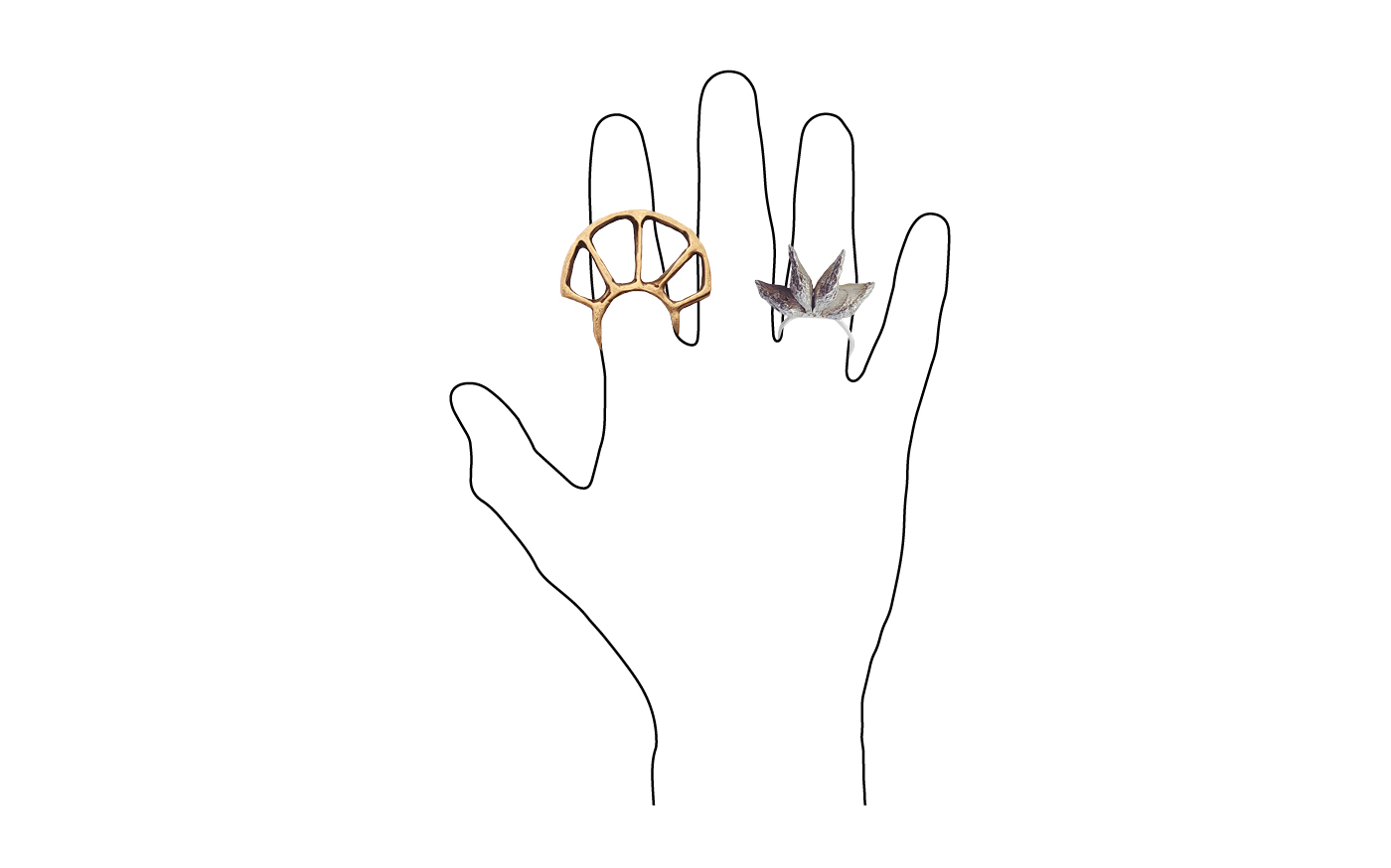
‘In Japanese comics, the sword [or the rings in our example] might now become very realistic, not only to show us the details, but to make us aware of the sword as an object, something with weight, texture and physical complexity.’[2]
Aside from increasing control over focus, using simple visuals can anonymize imagery to a certain degree and make it more relatable to a wide range of people. If a hand is depicted by a picture of a white person, it will be less relatable to people of different ethnicities. Using a stylized version of a hand where colour isn’t used, or where it can be changed, could help broaden the audience.
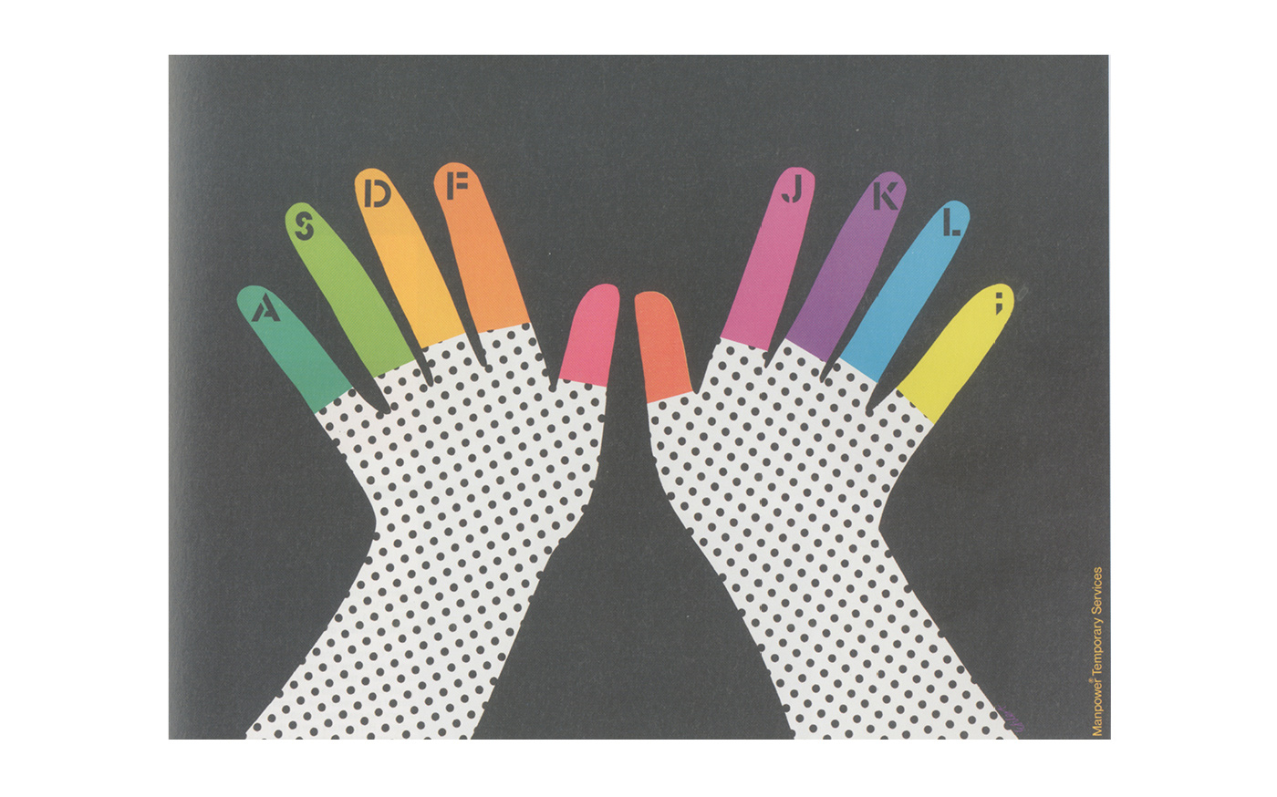
‘Another [power] is the universality of cartoon imagery. The more cartoony a face is, for instance, the more people it could be said to describe. […] Thus, when you look at a photo or realistic drawing of a face, you see it as the face of another. But when you enter the world of the cartoon, you see yourself. […] The cartoon is a vacuum into which our identity and awareness are pulled. An empty shell that we inhabit which enables us to travel in another realm. We don’t just observe the cartoon, we become it.’[3]

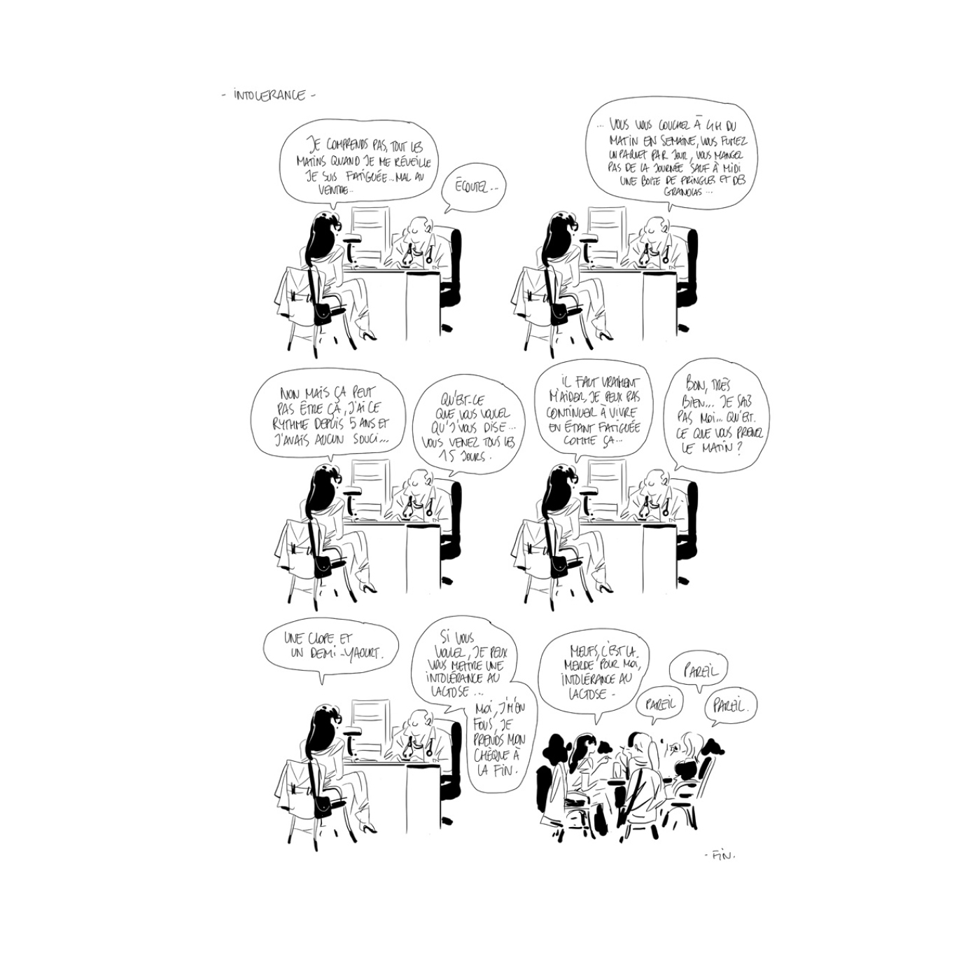
Bastien Vivès, a French comics creator, is a master when it comes to using simple imagery. Some of his most striking work is to be found in short stories where he often repeats the same drawing over and over again, where he then uses language to imbue meaning into his scenes, literally only changing the message within an image.
Simple imagery is also widely used in graphic design, where images are often a means to an end, the end being the communication of a specific message.
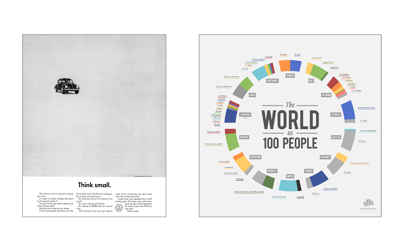
Whether it is in advertising, to focus on the product; in infographics, where complex information can be transmitted efficiently through simple visuals; or in logo design, where a simple shape can take on an identity bigger than itself and represent an immense organization; when used intentionally, simplicity can be an incredibly effective tool in the communication of a specific message.
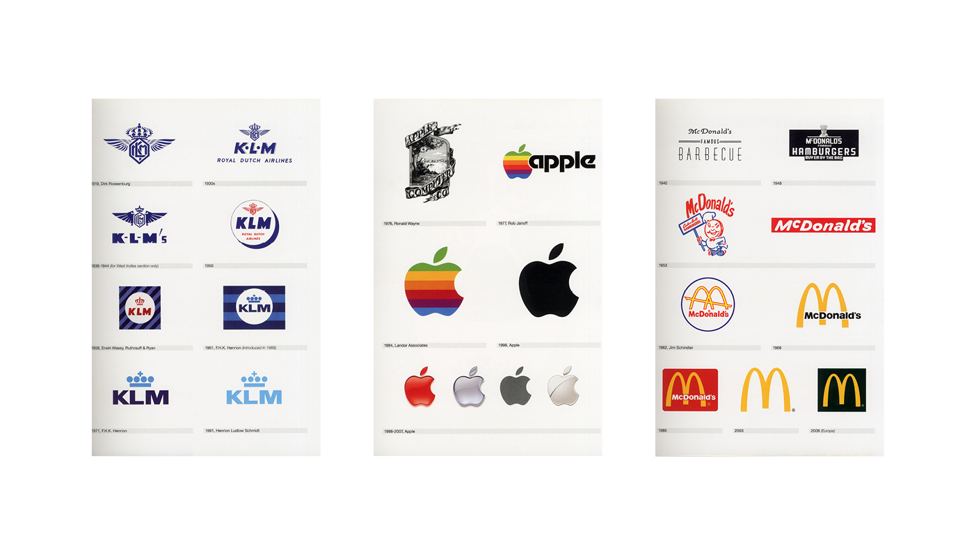
‘Our Job is to simplify, to tear away the unrelated obstructing the message.’[4]
=
